9 Retail Easter Displays You Can Take Inspiration From


Shop displays are a magnet for consumers patrolling the high-street; if you get them right anyway. A creative display could be the difference between someone entering and staying in your store, or walking by oblivious you exist.
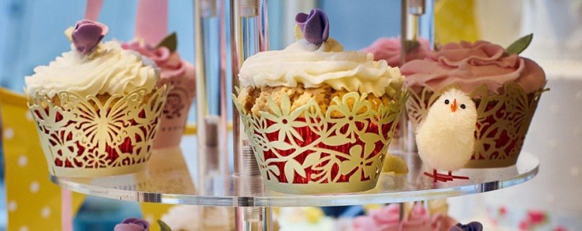
Themed occasions are always great for creating imaginative displays, and Easter, in particular, has a bunch of staples you can focus on.
The Easter bunny, spring, pastel colours, easter eggs and much more. However, everyone will be focusing on these staples, so you’ve got to work extra hard to make sure you stand out.
Also, you’ve got to remember that you need to tie your display into your Easter product range because the products are what generate the sales.
Work closely with your buying and merchandising team, and remember to stay on top of Easter trends, it’ll benefit you if you know what’s going to be popular.
Here are some of our favourite retail easter retail displays, and what we like about them. Are you feeling creative?
1. Suns Out Buns Out
We love a good custom window sticker if they’re done right, and this one by sweet shop Sugarfina certainly hits the mark. We love the play on popular culture, and the colours blend in well with the store.
Put yourself in your customer’s shoes – how would your customers feel about this sign? Eating sweets is about having fun, so we think Sugarfina got this one spot on. You can ask for opinions, too; but don’t be pushy.
2. Pushing Daisies
Flowers can inject colour into any window display, and Easter is the perfect time to add some spring happiness into your displays. We love the contrast of colour here, and it looks like the luggage has just been placed into a field of daisies.
Be bold, be brave – when you’ve got a bold product, it can be tempting to tone down the surrounding areas. This display doesn’t do that; two bold colours can co-exist without drawing too much attention away from one another.
3. Beatrix Potter, Anyone?
This display brings a feeling of nostalgia, and we can’t help but think Beatrix Potter and Peter Rabbit inspired it. The makeshift stand of the vintage chair also adds to the charm of this display. No matter what you sell, there are always ways to be creative and stand out.
Don’t forget to adapt in-store – don’t make an amazing window display and then forget about the inside of your store. If your customers are awed by the window display, and then they come in and there’s nothing about Easter inside, they’ll be underwhelmed. You want to wow them on the inside as well as outside.
4. Big Pastel Blowout
This is the first display we’ve included that has a human in it! Easter displays usually don’t contain mannequins because there’s so much emphasis on eggs and rabbits. We think this display pulls it off; the expression on the mannequin’s face is pure bliss.
Use pastel colours – soft pastel colours are synonymous with Easter and spring. Your whole display doesn’t have to be pastel colours, but if it works, why not? We think this display manages to incorporate a lot of colour without seeming too overpowering.
P.S. we wanted to show you this one because it’s awesome, too!
5. Stacking Genius
While this one isn’t going to win any prizes for sophisticated creativity, it’s fun and eye-catching, which is what you want from an indoor supermarket display. Would you fancy trying to get a pack from there? We’re surprised this one got by health and safety!
Location is critical – the big displays are usually at the front of a supermarket, and this hasn’t changed here. There’s no chance that any shopper would miss this display, and there’s no chance it wouldn’t bring a little smile to their face either!
6. It’s a Kind of Magic
Easter is a time surrounded by mysticism, and this display pays homage to it. At first, it can look a little messy, but as your eyes wander around, you can see the amount of love and care that’s gone into crafting this wonderful window display. The array of colour is breathtaking and thumbs up for the cuddle bunny.
Give it some texture – you want your displays to have some depth, thin displays can often look like you haven’t taken much care and need bulking up a bit. There are plenty of different textures in the above display, soft bunnies, wiry branches, paper lanterns and even a furry floor.
7. Let’s Get Minimal
Easter displays don’t have to be bursting with colour to be enticing, this simple, minimal design showing the shadow of a rabbit cutting a plant is mesmerising. We had to stop and take stock because we thought the plant was part of the drawing. What a fantastic way to mix the physical and the abstract.
Make a quick impression – as shoppers march around the high street, you only have a split second to grab their interest, and you need to create something that intrigues them. The above design is something you wouldn’t expect from an Easter display which is why we think it’s attention-grabbing.
8. Subtle Yet Effective
You don’t have to shout Easter from the rooftops to get a classy display. We like this display because the only direct relation to Easter is the eggs, but it still manages to look like an Easter display. Most of the products aren’t related to Easter, so it goes to show you what a subtle touch can do for your displays.
Coordinate and cross-sell – as we mentioned, most of these products aren’t Easter focused, but by adding a few slight touches, the company can cross-promote their items and make them seem Easter related.
9. On Your Bike!
We love how this antique store has incorporated some of their (cool) stock into their display. The flowers make it look like a scene straight from Amsterdam. While the flowers do add a touch of spring, it’s the simple addition of the egg that gives the display an Easter twist.
Work at eye-level – everything in this display is at eye-level, there are no distracting elements in the corner of the display. The focal point is the bike, so that’s where the display draws your attention.
Get Inspired & Start Planning Your Easter Display
Now you’ve seen some inspiring displays; you should be ready to go and plan your retail Easter display. Remember out top nine tips, so you get off to the best possible start:
- Put yourself in the customer’s shoes
- Be bold, be brave
- Remember to adapt in-store
- Use pastel colours
- Location is critical
- Give it some texture
- Make a quick impression
- Coordinate and cross-sell
- Work at eye-level
View our Easter collection and stock up in time for the festivities!


